We have to agree with the claim of many web developers and digital marketers that websites have come a long way from web pages that only contained textual information and photos to today’s ones that have much more complex content. Customer expectations are much higher than before, so now the website should inform, entertain, but also offer an intuitive general experience of staying on it, which in simple language means to be easy to navigate.
Everything, from the aesthetics of the site, to the place where the call-to-action will be placed, affects how long the customer will stay on it. How to make a website more user-friendly than it used to be is a topic we are constantly contemplating and below we share with you the conclusions we have reached.
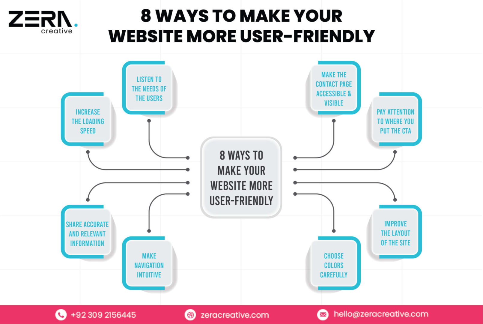

1. Listen to the Needs of the Users
Always ask regular visitors/customers of your website on behalf of the brand what they think should be found on the site and how it can be improved. When you receive this type of information, directly from those who are your primary target group, you come to important knowledge and see the content on the site through the eyes of customers, for whom it is intended.
Sometimes these comments are very precise, so with their help, you can better arrange the content and elements on the site. When the user is placed in the center of the process and the design and content of the site are made according to him, he automatically becomes user-friendly.
2. Increase the Loading Speed
The expectations of the average customer when he enters a website are such that he wants the content of the site to be loaded as soon as possible, so to speak, at the speed of light. They have these expectations especially when it comes to mobile devices. This means that (when ‘translated’ into statistics) half of them expect the site to load in two to three seconds and if that does not happen, they leave it.
3. Share Accurate and Relevant Information
In order for customers to make a well-thought-out purchase decision, they need to be familiar with a somewhat broader context and more information than the basic information they come across on, say, social media. If they have to ‘dig’ to learn such information on the site, they will certainly think that the company is hiding something and that the brand is not transparent enough.
Therefore, especially when it comes to the sale of some more complex machines or devices, it is important to explain the benefits of use as simply as possible, but also clearly and comprehensively enough, and so on.
4. Make Navigation Intuitive
When a customer comes to a website, he usually seeks the menu first to go in search of what he needs to buy. Therefore, the menu has a very important role in making the site as easy to navigate as possible because, with its help, the customer navigates through the content and finds the product he came for.
When he finishes his purchase or simply wants to come back for another product, there is a “Home” page, which he comes to again by navigating through the menu. However, you should not overdo it with individual tabs in the menu so that it does not become congested, so simplicity and priority selection should be your main technique when creating a navigation menu.
5. Choose Colors Carefully
Choose colors for your website carefully for several reasons. First, because a balance between beauty and clarity is needed, and we will clarify what that means immediately. Colors must be relevant to the industry to which the client belongs, and in addition, the contrast between the background and the text must be such as to give the site visitor the ability to quickly and easily read the content.
And did you know that with the help of colors, conversions on the site can be increased? This is another reason to choose and suggest colors carefully.
6. Improve the Layout of the Site
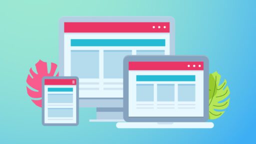
It is well known that more than 55% of Internet users access sites via smartphones, which they use more and which practically rarely leave their hands. That is why, if an online business wants to record increased sales of products through the site, it is important that its content is visible on all devices from which customers make a purchase (desktops, mobile phones, tablets, etc.).
Are you still wondering after this why it is important to understand responsive web design? We hope not.
7. Pay Attention to Where You Put the CTA
It is not enough to write a good copy, but also a clear and impressive CTA (call to action), which will encourage site visitors to buy something, sign up for an e-book, newsletter (whose subscriber’s base can be further enriched and improved using web services such as Benchmark), workshop, etc.
However, when the copywriter does his part, suggests where to put the CTA, one of your web designers enters the scene, with the mission to turn it into an even more striking and attractive one. For that, he will again use the contrast in the choice of background colors and the box/button for the CTA.
8. Make the Contact Page Accessible and Visible
Most website visitors who sell a product or service believe that if contact information is not available, the brand should not be considered for further actions on their side. Also, most are not satisfied if they see only a contact form or email on this page, but want as many ways to contact the brand as possible.
So, do your best to enable and add live chat options for your customers, and larger companies definitely need free-of-charge numbers where customers can reach them out. If we are talking about how to add credibility to the site itself and indirectly to the brand, this is a sure way.
Conclusion
It is important for every company, no matter what it does, to have a strong Internet presence these days. When it comes to the success of a website, there is one very simple truth to keep in mind – if you want customers to come to your site and use all its benefits, including online shopping, then that site must be easy to use.
If you want success, and your site is not user-friendly, then you are doing more damage to your business than benefit.


